Sales is one of the main pillars of any business and it plays a vital role in determining your cash flow. If sales is the veins of your business, then data is the blood that runs in those veins. From the smallest SMEs to Megacorps, it is important that the sales data is organized and accessible. In order to achieve that, businesses use CRM and related tools to organize sales data. However, CRM cannot provide the necessary data visualization. This is where data analytics comes into play.
Data analytics tools, such as Zoho Analytics, can be used to derive insights from all the raw data in your CRM. Do you want to know how Zoho Analytics can help your sales team in maximizing their sales efforts? Keep reading, as we discuss more on sales analytics and how our custom dashboards can help your sales team.
(Note: If you are looking for Zoho Analytics experts who can build custom dashboards for your business needs, we can help you. Contact CloudBound’s Zoho Analytics experts for a free consultation.)
What is Sales Data?
The conversion of cold prospect to lead, then to contact and a deal is a process. Tracking these processes for every customer/ client by collecting customer data at all points of contact constitutes sales data.
1. Demographic data: This is the most relevant information. These data include the size of the company, progress, location, revenue, contact details, etc.
2. Technographic data: You can make use of this data to know the day-to-day technologies people use. This may help you understand the technology and tools they are in need of and thereby customize your sales pitch accordingly.
3. Intent data: It detects the behavioral pattern of your customer online. It gives the likes or dislikes of any products/services for your knowledge. The intent data is used to derive the customer persona and help your sales and marketing efforts.
Significance Of Sales Data Analysis
Sales data analysis assembles a library of datasets for easy-to-read reports. Analytics is a software program that communicates sales performance in simpler forms. Statistics say that 58% of businesses attain their goals faster with a sales analytics tool. These include dashboards, KPI widgets, charts, and geographic maps. To increase conversion rate and revenue, sales analysis becomes an indispensable tool. Enhancing team performance, and cash flow, focusing on all areas, and making decisions are inclusive. What activities in a business are measured by sales data analytics? Total revenue, revenue per scale, product performance, sell-through rate, lead conversion rate, revenue by territory, etc.
Zoho Analytics is a powerful BI tool as well as embedded analytics. It pulsates you to take faster informed decisions. The embedded features of this analytics get your data reservoir from an arena to a casket! These statements will be proved in the next half of this blog.
Fringe Benefits Of Acquiring Zoho Analytics
The Zoho analytics bridges your CRM data and performance. It lets you know the deal won or lost rates and cold prospects to warm leads.
- Unique and customized dashboards, charts, and widgets in the form of reports.
- Datasets to metric conversion and giving a detailed granular level view.
- A 360-degree measure of your sales activities and product performance in every territory.
- It serves as supporting evidence to boost your team’s performance.
- The analytics is backed by AI, so making decisions is easier.
- You can even print, export, and mail these reports with ease.
In What Ways Does The Zoho Analytics Track Your Sales Activities?
There are numerous visualization ways to trace the performance of your sales reps. Advanced machine learning, AI, mapping tools, and embedded analytics empowers your analysis. Drench your datasets into various dashboards and widgets of Zoho analytics.
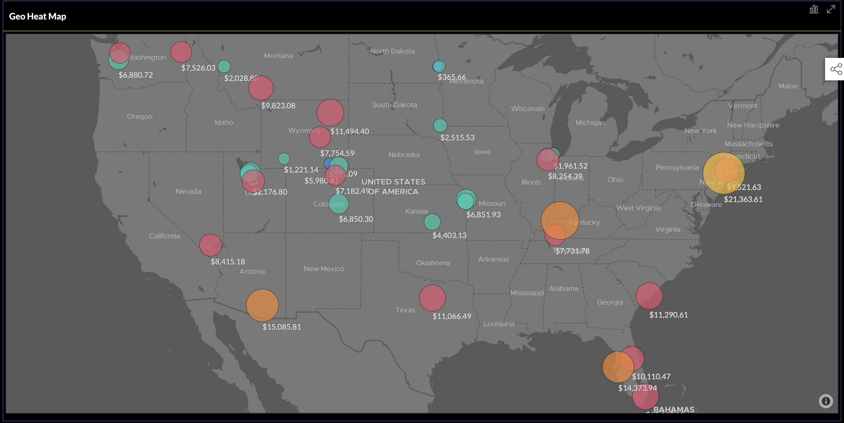
1. Geographic Maps

Using robust mapping software your territories are traced on the real map. An accurate map traces locations where your sales are high, low, or moderate. You can note the differences with the help of colors and shades. The dashboard captures high or low-density areas with a distribution of data. So, you have a lot of chances to win those plots and know the downfalls.
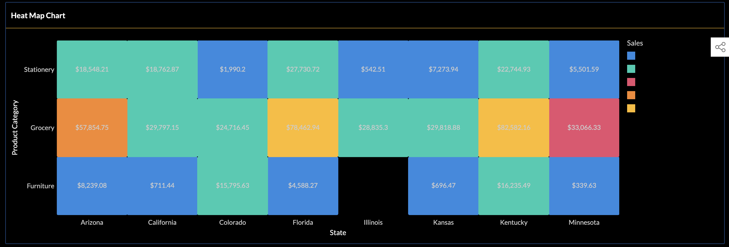
2. Heat Map

Here, you can see the graph has two axes showing product categories and states. This interprets the overall performance of your products in every area. The sales percentage and time is the variant that has more impact here. Even, manually it is impossible to analyze streams of data, which is easy with Zoho analytics.
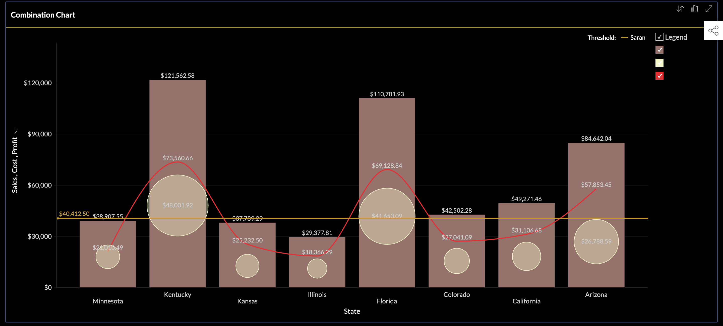
3. Combination Chart

A one-of-a-kind BI report depicting geographical areas where the profitability is higher than costs. The two-dimensional combination chart represents sales, costs, and profits against territories. It displays even the business profits and overall cost budget behind every sale. The wave across every bar diagram highlights the net profit if it is a pitch or a fall.
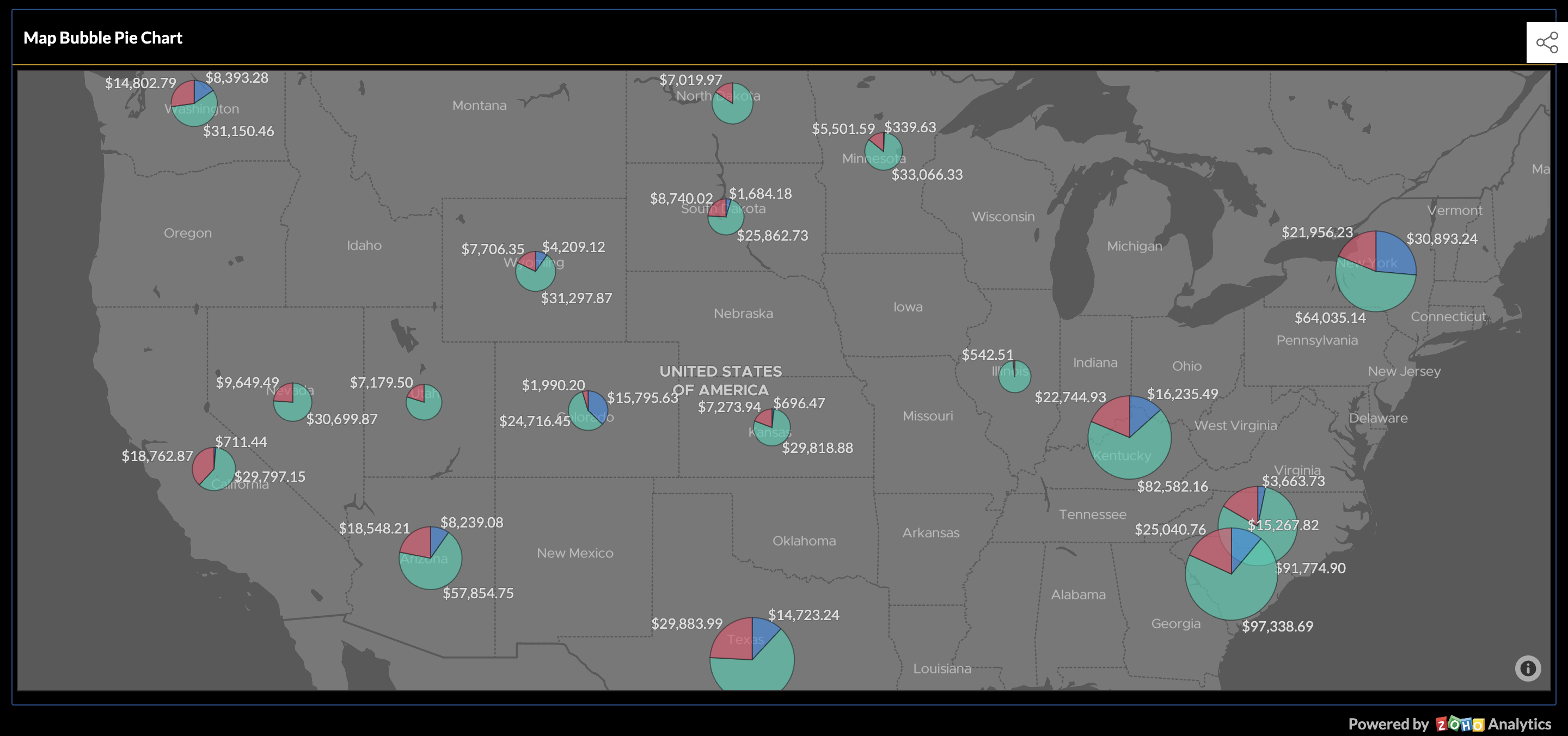
4. Map Bubble Pie Chart

It signifies the sales across every state on a real map representing a pie chart. The bubble pie chart shows sales for every product differentiated with colors and shades. Hence, it combines all the essential vertices of your data and gives the best explanation.
Conclusion
Set up your intentions in scoring the maximum profit from your business! Reach us to get your choice of customized Zoho analytics now! Secure the rest of your business journey by focusing your sales at any time and anywhere.
Enjoy using the dashboard attached to take a short ride to know its capabilities. Try it for free! Sign up with our expert team to build, navigate, and explore your data with one tool – Zoho Analytics.
